Monday, January 7, 2013

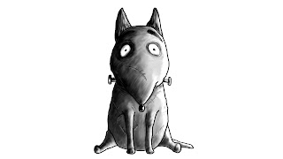
Frankenweenie.

老实说,
这个部落格已经生尘了,
界面也中Bug,
所以也懒得去打理。
所以我说,
也是有想过把这部落格给关闭。

接下来就是post一些我为上个学期motiongraphic assignment 2
所贡献的character digital painting。
 就只是负责画人物。
我觉得也不需要放什么mark water, 毕竟我都是照着画。
画的都是Frankenweenie电影内的人物:
(大小比例不定)


以下就是我们来不及赶完的完成品:

就这样。

Friday, June 1, 2012

'Black Viper' Battle Mobile.

It's taken me long time for not updating this blog.
Still the same, kind of lazy to manage it, 
somehow feel that nothing much to post here.
Therefore, Slacking Slacking Slacking untillllll... 
Now!

Learnt something new,
the 'Real 3D', ain't the 3D created from Illustrator or Photoshop.
As a beginner level user of 3Ds Max, modeling an object was not that hard.
(if only you know how to play with those shapes)
  First Assignment, was asking us to create a chess piece. Decided to mould a Knight in horse shape.

Well, the 2nd part of assignment 1 is to create a creative object.
Creative object? what is the term?
something that doesn't exist or cool enough?
The very 1st object that pop-up in my mind was robot.
However, was giving up this idea because I predicted lot of them might do robot as well.
To avoid from comparison, I planned to create motorbike. 
Why I decided to create motorbike? it's challenging and I would like to own one.  
I don't really know how a motorcycle works, 
but at least doing some research on it might help me to get some ideas.

What are those coolest bikes that came in my mind? 
Definitely Tron Light Cycle, Batman Mobile and even Ghost Rider motorcycle.
Not going to combine them into 1, but observed their functions and special characteristic which may help me in development process.

What I was planned to create my own cycle by modified from: 
The tires of  Tron Light Cycle, 
The Machine Gun from Bat Mobile, and
The Ghost Rider's Handle.
The Roughly idea was sketched, but What I sketch is totally different from what I made:
There's a mistake that I observed from the picture above, The Handle is too big.

Well after keep changing x3~
Found out that my motorbike was lack of something,
Yep, a THEME. 
There's must a Mascot that identified my mobile.
Thought to create a SPIDEY Mobile with 8 spider legs.
At the end picked the theme of Cobra, Anaconda or watever poisonous snake.
So I called it as VIPER.
The concept of my Viper Battle Mobile:

However, it's not absolutely done, yet still 80%.

After the 3 days hardwork,

Here it is:
BlackViper Battle Mobile.

Kind of Satisfied. =]
Hopefully one day I make it real.
(if only without bullets)

Wednesday, March 28, 2012

Cattie © The Concept Toys. 28/3/2012

Relating to the previous post,
but I have nothing much to say because of my laziness.
Well, just be here to show a part of my Cattie Concept toys.

The logo:

BatCat (Batman concept)
BickeyMiao (Mickey Mouse concept)
IronCat (Ironman Concept)

Stop here. 
Will posting more Cattie concept toy soon on my next post.
#StayTuned.

Saturday, March 24, 2012

Cattie © 24/3/2012

感觉上已有N年没更新这部落了,
就连我本生的专用部落也懒得更新了。
上久前都是在忙着Assignment,
Interactive Web Design 课程要我们做一个网页,
来promote属于自己的D.I.Y 产品。
D.I.Y 的产品可以是Photoshop或Illustrate,
所以当然是不会这么无聊把钱真的花在真实的D.I.Y产品身上。
(那当然如果有额外加分,确实会去考虑下。)

起初是想选‘鞋’来当题目的,
觉得好像很没有发挥空间,加上我普遍,
所以就换题目选做D.I.Y Toy.
玩具都要有一个款式,
由于动物之间,我只能想到猫,
所以就把猫当作玩具模型的主题。
而这玩具的Brand也想好了,Cattie.
以下是完成后的几不像猫的猫:
(3D的部分等下再mention)
感觉好像要开教学课程这样。

刚开始sketch的时候还算很三心两意,
喜欢一直更改模型猫的形状,
就这样定型:

接下来就是要做一个2D的模板,
总之就是平平的,毫无gradient的那种最好。

由于当时想到说,如果一个产品不真实,这样就太假货了。
说是做玩具了,所以都得3D一点。

重点来了,如何把2D变成3D算是艰难的事。
要面对的两大问题:Quality and Quantity.
当时只能想到如何解决Quality, 就用Gradient 来Fill 每个模板的Colour就会变3D了。(有这么想过)
但如果遇到多的数量,你又是不是要每一次用不同颜色的Gradient来Fill不同的模板?
(不是不可能,只是很浪费时间,毕竟时间有限。)
所以最后做了一个实验,我觉得这个实验很成功。

要从2D变3D, 首先是要开启一个白色的模板,
之后用Mesh Tool, 或是‘黑白的Gradient’ 来Fill 成像以下这个样子:
该暗的地方暗,该亮的地方就亮。
3D的Theory就是一定要有暗与亮之处。

当你有两个模板后,(一个是2D有图案的,另个就是3D的黑白模板),
把它们各自save在png或是AI file.
之后再开启Photoshop,
把两张图片放在一起:

把3D模板和2D模板的位置排成一体,
(3D要在2D的上方,对比度要刚好)
在3D模板的layer上,从Normal换去Multiply,
你就会看见像以下这样的情况:
有3D到吧?不过好像还不够.
所以这时候,你就要在3D模板的layer上 Press 'CTRL + J'
感觉上是比较凸显和黑暗了吧。
(可以按多几次CTRL + J, 如果你觉得不够立体)
(也可以调opacity, 如果觉得太暗)

现在该如何把颜色给打亮?
再按多一次CTRL + J, 然后把那个layer从Multiply换去Overlay, 
再调低opacity,
就会变成这样:
是觉得比较3D了些吧。

觉得某些地方不够立体?
可以用brush with White Colour 3% Opacity 在某些部分打亮:
特别在眼珠、耳方和身体左侧打亮。
大功告成!这就是我的成品啦。
其他的成品也是用这个方式,所以3D的模板很重要(一个模板就够了)。
有了2D和3D模板,5分钟就可以Transform 2D to 3D了。

以上都是我所Explore出来的方式,
不知道还有没有更快的方式来解决Quantity的方案。

就这样,下次再来分享下一些怪招。

Wednesday, December 14, 2011

Count For My Return. 26/12/2011

好像有一段时间没上来这里了,
大概两个月左右。
也是时候订下一个时间去更新了。
12月30日,
我一定会再回来,
之后就会不停的更新,
(如果我真的没东西做)。

几个礼拜前设计了一个能够展示自我特征的图,不算logo。
很明显我的名字就在那,
三个不同颜色的圈也代表着
每天与我共同进退挂在身上的物体,
而那两个黄色的Line也象征着那黄色的圈。
(我觉得你们也不知道我在说着什么,
等你看到了那个物体,你自然会明白)
其实这张设计的概念是来自RUN MLK的设计:
(以下这张)
纯粹觉得Simple的Design也可以很不错。=]